
I know a lot of amazing software engineers, but I know far fewer amazing communicators. In the next couple posts, I will focus on communicating software design, and I will share some of the specific techniques that have helped me communicate this topic more effectively across different audiences. I invite you to take anything that works for you and evolve it as it suits your purposes.
Did You Say Software Design?
Yes, dear reader, “software design”. The way I see it, there are three main uses of software design as an activity:
- Production of design artifacts that can be communicated to software implementation teams, or other groups
- Promotion of thinking about the software on a holistic level, before the software product is actually built (see interesting discussion at [1])
- Capturing design for reverse-engineering or historical use
Writing For The Audience
Have you ever reviewed a conceptual or design document for a colleague, only to have that colleague become very defensive when you offer feedback? It makes you wonder why they would ask you to review their document in the first place, right? Perhaps they were looking for affirmation rather than honest feedback. There is always some degree of ego investment in our work, so it is very natural to write in a self-centered manner. We tend to write as though everyone should automatically understand our perspective, and I struggle with this dilemma myself.
What is the point of writing software design-related content, if the purpose is for oneself? The entire objective is to communicate from point A (the author) to point B (the audience). Ergo, we must remember that the audience, and not our own selfish purpose, is what really matters.
That said, transitioning to an audience-centric way of thinking can be very difficult to achieve in practice. Here are some rules that I use in my own struggle to be mindful of the audience.
Write, Question, Review, Repeat
When writing content that is destined for people other than myself, I have learned to try to stop and ask myself: “Who is going to read this?” Then I adjust the content to what I perceive as being understandable to the intended recipient. Ideally, I will ask someone that seems to represent the target audience to review the material, so that I can deliver a message that is on-point. I have found that the output of such a feedback loop is always better than what I would produce otherwise.
Manage Terminology
In order to deliver a solid message, I have found that it is critical to manage terminology. By “manage,” I mean these things:
- Introduce new terminology at a rate that an audience can digest. In terms of a software design document, that might mean not giving an enormous class diagram all in one shot – introduce it in consumable chunks, to allow the audience to relate or mentally engage with the chunks as you communicate them.
- Use consistent words for the same concepts. This is particularly important when presenting to a technical audience that might interpret your words as an statement on specific entities in the problem space.
- Only use acronyms that the audience is already familiar with, or that are directly relevant to the topic at hand.
- If you must present new acronyms, make sure you define them on first use.
The Right Diagrams For The Job
Software engineers are usually very smart people, but many software engineers seem to shy away from diagrams. Perhaps it is a lack of tools, lack of time, or lack of confidence in making visualizations. These are understandable challenges, but none of these things should prevent you from exploring your skills in this area. Our industry has created design nomenclatures like UML, and frameworks like TOGAF to facilitate and communicate software and system design. If you were in the software industry before UML existed, you probably remember Coad-Yourdon (once considered the bible of object-oriented analysis), Rumbaugh, and so forth. Free or low-cost tools like Lucid Charts and websequencediagrams are removing barriers to producing decent diagrams without much investment.
I draw a lot of diagrams. I often refer to them as “mental pictures” because I generally imagine the topics visually before I communicate them. Very few of these diagrams are UML, even though I was once a UML purist myself.
When capturing and/or communicating a software design, it is especially critical to understand the audience, and in particular, their level of technical background. Delivering a software design to a team of experienced software engineers, you may select a technical communication mechanism – and the engineers probably appreciate that. Communicating the design to a business audience using the same mechanism might be far less successful.
Example
As an example, suppose we are dealing with a specific low-level design issue in which we find it necessary to refactor an order processing system. In this refactoring, we decide to decouple an order from its details, so we decide to move from composition to aggregation. For a software team, I might communicate that the starting point was as illustrated below:
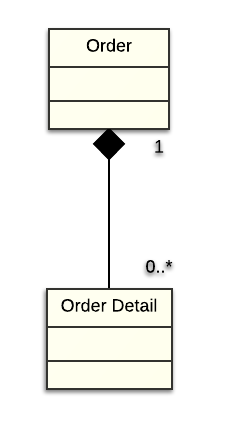
Based on this diagram, any person with UML skills can observe that the original design involved Order objects in a containment relationship with zero or more OrderDetail objects per Order. The revised design would, of course, be something like this:
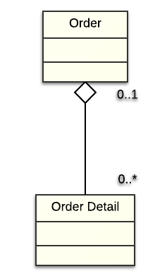
This diagram tells the reader that the new Order design is an aggregation relationship, in which an Order can still relate to zero or more OrderDetail objects. Very importantly, an OrderDetail object can exist without an enclosing Order object. Ignoring the philosophical trade-off of composition vs aggregation, this seems to be a very straightforward and understandable evolution of the concepts, when presented to a software engineering audience.
UML purists may disagree, but I have observed from my own experience that the subtle nature UML nomenclature is lost on those without a UML or software background. In short: the above diagrams do not adequately make the point – and in fact, they add confusion – without an accompanying explanation. For this reason, I choose not to communicate in this manner with a non-technical audience. If I were to attempt to make the same point with a non-technical audience, I would describe the current design like this:
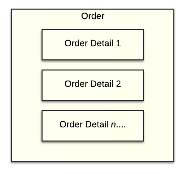
We can see that the composition idea is transmitted simply by placing OrderDetail blocks inside the Order block; the cardinality is illustrated by showing multiple OrderDetail blocks. While it still requires some helpful narration, drawing composition this way relies on the seemingly-obvious visual metaphor – rather than the UML semantics – to make the point about the relationship between the objects in question. Similarly, to communicate the aggregation relationship, I will use something like this over the UML version:
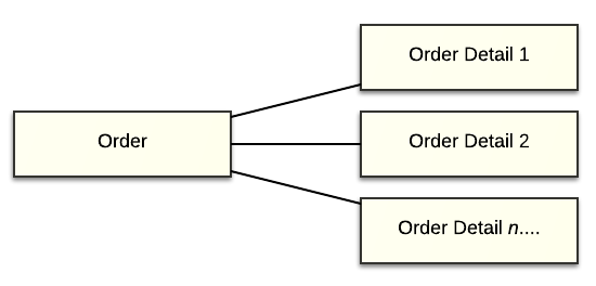
Isn’t this blasphemy? To some, perhaps. I prefer to think of it as using the right diagrams for the job. It has nothing to do with dogma, and everything to do with breaking through misunderstandings and assumptions. To that end, I will use any visualization technique that I believe helps make the point that I am attempting to communicate. I have gone as far as hand-tooling some dynamic visualizations using the great D3.js. Yes, this might be more work than exporting pictures from my favorite UML tool. I might have to maintain two separate sets of deliverables using this approach. But I think it is well worth the effort. I prefer giving a consumable message, over a message that nobody can understand.
In the next post, I will share some other perspectives that I have found valuable in certain situations.
References
[1] http://www.scaledagileframework.com/agile-architecture/